Component App Project
In this section, you will create a new Tethys Component App project using Tethys Platform's Command Line Interface.
Let's get started!
Open a terminal and Activate Your Virtual Environment
All bash code blocks you will see throughout this tutorial must be entered via command line within the Virtual Environment you created when installing Tethys Platform. Such code blocks will look like the following example:
echo "This example code block must be entered via command line"
Scaffold a new Tethys app using the component project template
tethys scaffold geoglows_tutorial -t component
This command will prompt you for input via the command line. For this tutorial, accept all of the defaults by simply hitting Enter with each prompt.
The completed command will create all of the necessary files and directories for your app, which are as follows:
tethysapp-geoglows_tutorial  - App project root
├── install.yml - Tethys project configuration.
├── pyproject.toml - Python project configuration.
├── README.rst - Documentation.
└── tethysapp/geoglows_tutorial/ - Python package root
        ├── __init__.py - Python package initialization
        ├── app.py - Application code
        ├── public/images/ - Public images
        |   └── icon.png - Default icon
        └── tests/ - Tests
            └── ``test.py`` - Test
Install the app into Tethys Platform:
tethys install -d
Include -d to install the app in development mode, which allows you to make changes without needing to reinstall the app each time. The Tethys server will automatically reload your app when you save changes to any Python files within the project.
Apply migrations
tethys db migrate
Note
This migration is only necessary if this is the first time you are creating a Component App. For subsequent Component Apps, this can be skipped.
Start the Tethys server
tethys start
Open your application in the browser
Navigate to http://localhost:8000/apps/geoglows-tutorial and login using the default credentials:
You should be redirected to a page that looks like this:
Note
The color of the header may be different than what is shown below, since we instructed you to accept the randomly generated default when scaffolding the app.
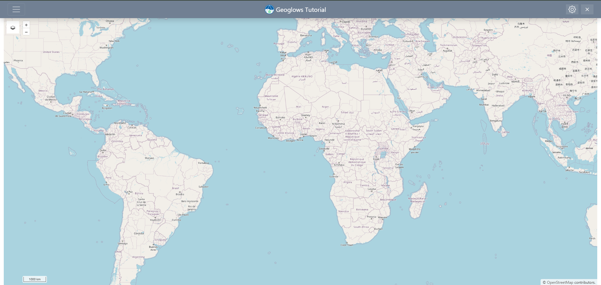
This is the default page of your new Component App project. It includes the following features:
- A navigation header containing:
A hamburger menu icon meant for navigating to other pages of your app (which currently only reflects the "Home" page that you are on)
A default app icon
The name of your app
A gear icon for accessing the admin app settings
An "X" icon for exiting the app and returning to the "Apps" library page
An interactive map with a default basemap and basic controls.
You will see these features reflected in the code of your app during the next step.